Fields are not controls
A control is an interactive element. A field is a container housing one or more controls.
Today us developers love to use component libraries, and that's great! However I have found a lot of libraries struggle to draw a clear line between what a control is and what a field is.
The stock standard web experience we all know is forms with field inputs. Each
field has some form control (such as a text input, checkbox, etc) where the
user fills in some value. These components are often exposed as TextField or
similar names. They make building your forms easy, but they often take in
fields such as label, errorMessage and so on. It is obvious from the prop
list that they are built for forms.
Unfortunately there are far more use cases for controls than just forms.
Fields vs Controls
When we think of fields, we often think of rectangular fields, composed in a neat layout that together make up a form that expect us, the users to fill in some information. Update your social media profile, or set the delivery address of an online order. Perhaps something like I've drawn here:
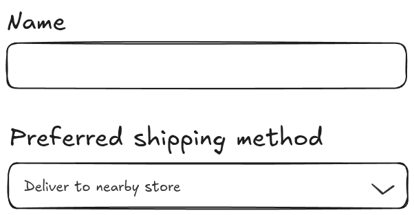
Each field has some type of input. Maybe a single-line text input for your name, or a textarea for additional instructions to the delivery personell. More complex inputs also exist, such as radio buttons, checkboxes, or select menus. In order to promote an intuitive and good user experience, we often see these inputs composed together to provide bonus functionality.
A combobox is a rectangular field, with a dropdown button that opens a popover that contains a list of items. It also has a text input on top for easy filtering of alternatives when the options are many. Each option in the list of alternatives has a checkbox that indicates its selection state.
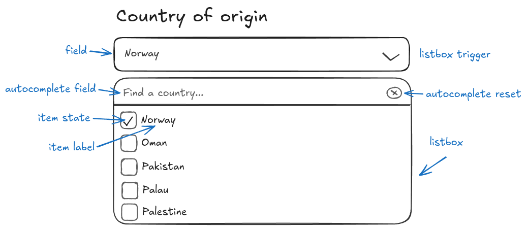
This is a complex field! It's a singular rectangle on a form, but inside hides
many different controls that alter the field's state. We also find the exact
same pattern in at home. The HTML <input type="number" /> element has two
spin buttons on the right, one for increment and one for decrement.
Now that we know that inputs may have multiple controls, we should also consider the case where controls do not have an associated input.
Standalone controls, or alternative triggers
Not all controls are triggered by the user navigation or clicking on a visual field. A context menu (although arguably bad for accessibility, as users without a mouse cannot use them effectively), a sub-menu, or activation through a keyboard shortcut are examples of triggers that should show a control to the user.
The combobox we looked at earlier might be triggered from a button instead of a text input, or it might appear on-hover in a dropdown.
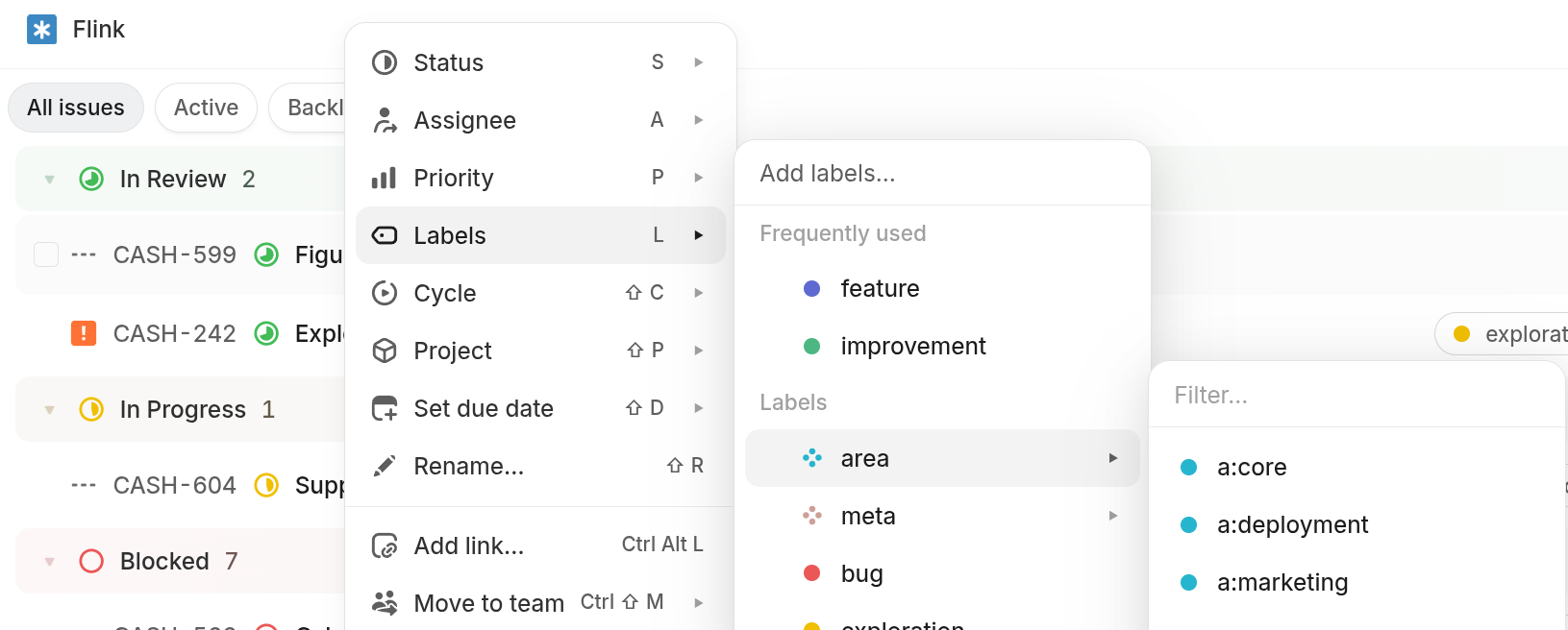
Linear is a product I like that uses controls that originate from triggers other than buttons or forms well. This complex label selector is spawned from a nested select within a menu that is contained within a context menu triggered by right-clicking on the page.
Alternative triggers can promote a significantly better user experience if used properly.
Today's lesson
Controls are interactive elements that modify or control some state. In order to use a control, the user is typically presented with a trigger. In a lot of cases the trigger is a field, but it doesn't have to be a field. It could be any user interaction.
It is the composition of controls that allows us to build expressive forms. But the same idea may be applied to non-form triggers such as buttons or context menus.
Form fields are just one kind of trigger, albeit a very common one.
Modern libraries such as React Aria, Radix (which is mostly unmaintained unfortunately) and the newer Base UI take composition of controls seriously and I would greatly recommend trying one of them out. React Aria is certainly my favorite!
These libraries are primarily accessiblity-first focused, but a thing they all have in common is great composable component APIs.
Blog content licensed under CC BY-NC-SA 4.0 DEED.